THE BARN

THE BARN is a Berlin specialty coffee roaster with an international e-commerce storefront.

During my time there, I worked across frontend development, Shopify architecture and UX/UI, modernizing parts of the storefront while reducing unnecessary platform complexity.

Year
2023 to 2024
Role
Full Stack Engineer
Type
E-commerce / Product
Disciplines
  • Frontend Development
  • UX/UI
  • Shopify Architecture
  • Performance
  • SEO
Location
Berlin
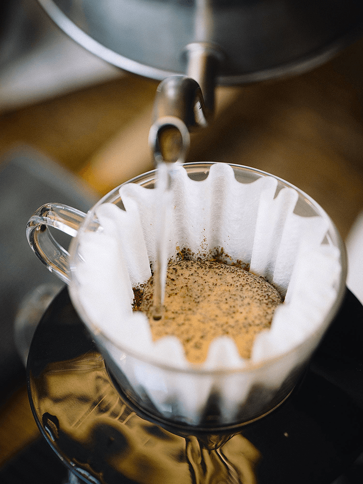
Water pouring from a kettle onto ground coffee in a paper filter.
THE BARN, Berlin.

System

The storefront had accumulated third-party functionality and implementation complexity over time.

Part of my work was identifying where existing Shopify capabilities could replace redundant plugins, and where structured platform features could make the storefront easier to maintain.

I replaced plugins whose job the platform already did natively, and moved content without a clear structure into metafields and metaobjects, so it could be edited and reused without changes to theme code.

  1. Redundant third-party plugins replaced by Native Shopify functionality

  2. Unstructured content replaced by Metafields and metaobjects

Landing page

The homepage evolved significantly between 2011 and 2024. This study reconstructs 18 documented versions from archived captures, using 142 measured sections to show how the page’s structure, hierarchy and priorities changed over time.

  1. 01 Archive

    2011

    4 sections · 767 px measured

    First viewport only

    The homepage is extremely sparse and mostly logo-led, with very little content visible beyond navigation. It appears to function more as a digital front door than as a complete commercial destination.

  2. 01 Archive

    01.12.2013

    4 sections · 1,872 px measured

    The page becomes dominated by a large product-and-image grid. The homepage starts carrying more of the shop itself, suggesting a shift from simple brand presence toward browsing and product discovery.

  3. 01 Archive

    2017

    6 sections · 2,019 px measured

    Header partly missing

    A large photographic hero appears, followed by brand messaging, category navigation and editorial content. The homepage begins to balance commerce with a stronger brand and storytelling role.

  4. 01 Archive

    17.05.2018

    7 sections · 2,565 px measured

    Header partly missing

    The same structure expands with more brand content and a longer page. The homepage appears to be taking on more responsibilities at once: storytelling, category navigation and ongoing editorial content.

  5. 01 Archive

    17.12.2019

    11 sections · 5,806 px measured

    The page accumulates

    The page becomes substantially longer and more modular, combining seasonal promotion, products, editorial content, locations and social proof. This suggests the homepage is becoming a broader brand-and-commerce hub rather than a single-purpose landing page.

  6. 01 Archive

    2020

    10 sections · 4,787 px measured

    Subscriptions appear directly inside the opening hero structure while products remain prominent further down. Subscription is no longer only a secondary destination; it begins to enter the primary browsing hierarchy.

  7. 01 Archive

    21.10.2021

    11 sections · 5,650 px measured

    The hero introduces direct actions for both buying beans and subscriptions, while brand, products and editorial sections continue below. The opening area becomes more explicitly action-oriented, even as the page remains content-heavy.

  8. 01 Archive

    12.10.2022

    12 sections · 6,091 px measured

    Subscriptions become persistent

    Subscriptions appear repeatedly across the experience: in navigation, the hero and a dedicated section. The structure suggests subscription is becoming a more persistent commercial priority rather than a single isolated offer.

  9. 02 Observation

    14.11.2023

    11 sections · 5,087 px measured

    Promotion and proof before primary commerce

    Seasonal promotion, awards and campaign content occupy much of the upper page, while subscription plans and products appear later. Multiple priorities compete for attention before the visitor reaches the core commercial sections.

  10. 02 Observation

    20.11.2023

    13 sections · 6,540 px measured

    Capture gap

    The page continues to layer promotional and subscription content, including more than one subscription block. The repetition suggests the offer is important, but its role in the overall hierarchy is still not fully resolved.

  11. 02 Observation

    18.12.2023

    11 sections · 5,829 px measured

    A collection above the hero

    A product collection appears before the main hero, breaking the expected hero-first structure. This appears to push seasonal commerce more aggressively to the top of the experience.

  12. 02 Observation

    29.12.2023

    12 sections · 6,144 px measured

    Commerce moves up

    The page becomes more product-led: a focused hero is followed immediately by a featured collection, while awards and supporting brand proof move further down. The hierarchy begins to favour product discovery and action over supporting content.

  13. 03 Intervention

    17.05.2024

    Study

    5 sections · 1,353 px measured

    Top of page only

    The header gains structure

    The redesign concentrates attention around a more structured header and a subscription-led hero. Subscriptions move from being one section among many to becoming part of the primary navigation and opening proposition.

  14. 03 Intervention

    17.05.2024

    Study

    5 sections · 1,353 px measured

    Top of page only

    From general to specific

    Across the F1 → F2 → F3 studies, the message becomes progressively more specific and actionable. The exploration moves from a broad brand statement toward a clear subscription proposition with a dedicated CTA.

  15. 03 Intervention

    11.06.2024

    Live

    9 sections · 4,884 px measured

    Subscription as an entry point

    The live storefront carries the new header structure forward, with utility navigation, clearer primary navigation and a persistent Subscription Plans entry point. The hierarchy now makes important commercial paths visible before the visitor begins moving through the rest of the page.

2011 (First viewport only): Utility, Hero, Navigation, Capture ends. The homepage is extremely sparse and mostly logo-led, with very little content visible beyond navigation. It appears to function more as a digital front door than as a complete commercial destination. 2012 (First viewport only): Utility, Hero, Navigation, Capture ends. The homepage is extremely sparse and mostly logo-led, with very little content visible beyond navigation. It appears to function more as a digital front door than as a complete commercial destination. 01.12.2013 : Navigation, Hero, Products, Footer. The page becomes dominated by a large product-and-image grid. The homepage starts carrying more of the shop itself, suggesting a shift from simple brand presence toward browsing and product discovery. 2014 : Navigation, Hero, Products, Footer. The page becomes dominated by a large product-and-image grid. The homepage starts carrying more of the shop itself, suggesting a shift from simple brand presence toward browsing and product discovery. 2015 : Navigation, Hero, Products, Footer. The page becomes dominated by a large product-and-image grid. The homepage starts carrying more of the shop itself, suggesting a shift from simple brand presence toward browsing and product discovery. 2016 : Navigation, Hero, Products, Footer. The page becomes dominated by a large product-and-image grid. The homepage starts carrying more of the shop itself, suggesting a shift from simple brand presence toward browsing and product discovery. 2017 (Header partly missing): Navigation, Hero, Brand, Categories, Editorial, Footer. A large photographic hero appears, followed by brand messaging, category navigation and editorial content. The homepage begins to balance commerce with a stronger brand and storytelling role. 17.05.2018 (Header partly missing): Navigation, Hero, Brand, Brand, Categories, Editorial, Footer. The same structure expands with more brand content and a longer page. The homepage appears to be taking on more responsibilities at once: storytelling, category navigation and ongoing editorial content. 17.12.2019 : Utility, Navigation, Hero, Brand, Promotion, Products, Products, Editorial, Locations, Trust, Footer. The page becomes substantially longer and more modular, combining seasonal promotion, products, editorial content, locations and social proof. This suggests the homepage is becoming a broader brand-and-commerce hub rather than a single-purpose landing page. 2020 : Utility, Navigation, Hero, Brand, Products, Products, Editorial, Locations, Trust, Footer. Subscriptions appear directly inside the opening hero structure while products remain prominent further down. Subscription is no longer only a secondary destination; it begins to enter the primary browsing hierarchy. 21.10.2021 : Utility, Navigation, Hero, Trust, Brand, Products, Editorial, Brand, Brand, Newsletter, Footer. The hero introduces direct actions for both buying beans and subscriptions, while brand, products and editorial sections continue below. The opening area becomes more explicitly action-oriented, even as the page remains content-heavy. 12.10.2022 : Utility, Navigation, Hero, Trust, Subscription, Products, Products, Products, Newsletter, Brand, Brand, Footer. Subscriptions appear repeatedly across the experience: in navigation, the hero and a dedicated section. The structure suggests subscription is becoming a more persistent commercial priority rather than a single isolated offer. 14.11.2023 : Utility, Navigation, Hero, Trust, Promotion, Subscription, Products, Brand, Locations, Brand, Footer. Seasonal promotion, awards and campaign content occupy much of the upper page, while subscription plans and products appear later. Multiple priorities compete for attention before the visitor reaches the core commercial sections. 20.11.2023 (Capture gap): Utility, Navigation, Hero, Promotion, Subscription, Products, Trust, Products, Promotion, Subscription, Locations, Not captured, Footer. The page continues to layer promotional and subscription content, including more than one subscription block. The repetition suggests the offer is important, but its role in the overall hierarchy is still not fully resolved. 18.12.2023 : Utility, Navigation, Products, Hero, Products, Promotion, Subscription, Locations, Trust, Brand, Footer. A product collection appears before the main hero, breaking the expected hero-first structure. This appears to push seasonal commerce more aggressively to the top of the experience. 29.12.2023 : Utility, Navigation, Hero, Products, Products, Subscription, Brand, Editorial, Locations, Trust, Brand, Footer. The page becomes more product-led: a focused hero is followed immediately by a featured collection, while awards and supporting brand proof move further down. The hierarchy begins to favour product discovery and action over supporting content. 17.05.2024 Study (Top of page only): Utility, Navigation, Hero, Brand, Products. Across the F1 → F2 → F3 studies, the message becomes progressively more specific and actionable. The exploration moves from a broad brand statement toward a clear subscription proposition with a dedicated CTA. 11.06.2024 Live: Utility, Navigation, Hero, Products, Categories, Brand, Editorial, Newsletter, Footer. The live storefront carries the new header structure forward, with utility navigation, clearer primary navigation and a persistent Subscription Plans entry point. The hierarchy now makes important commercial paths visible before the visitor begins moving through the rest of the page.

Catalog study

Eight specialty-coffee catalogs reduced to structure, rhythm and package language. The comparison looks at how density, editorial interruption, color and package form shape product discovery.

01 Catalog field

Eight catalogs, one shelf

Each strip is one collection page, top to bottom, drawn to its captured length. Brown outlines mark editorial breaks in the product rhythm.

Coffee Circle and Verve carry the most products per scroll. Coffee Circle breaks the grid with offers; Verve almost never does.

02 Package language

Package language

One glyph per observed package variant (silhouette, body and colour mark), not per product. Outlines show the formats that appear later in each list.

THE BARN repeats one kraft bag. Packaging carries no product colour, so tags and buttons do the differentiating - each card carries more interface.

Verve, Five Elephants and Nomad keep one shape and change one colour per coffee. The package becomes the index. La Cabra and Red Rooster show fewer coffees, larger. La Cabra puts the colour in the photograph, Red Rooster in the illustration.

03 Structural reading

A structural reading

Density is calculated from the captured catalogs. The remaining positions are interpretive readings of the source material.

THE BARN sits between dense and sparse on measured density, and toward the utility, muted and uniform ends of the three readings.

THE BARN: 27 products; columns 3; product grid 68% of the page; 2.9 products per 1,000 px; 0 editorial breaks in the product grid. Zones from top: navigation, header_title_filters, grid, grid, grid, category_tiles, footer. Package: tall stand-up bag (kraft). Colour: one colour for every coffee; differentiation via UI tags. Coffee Circle: about 36 products; columns 4; product grid 48% of the page; 3.9 products per 1,000 px; 3 editorial breaks in the product grid. Zones from top: navigation, header_title_filters, grid, text, editorial, text, footer. Package: tall slim bag. Colour: two field colours (green, mustard) + striped accent band. Five Elephants: 16 products; columns 4; product grid 59% of the page; 3.9 products per 1,000 px; 1 editorial break in the product grid. Zones from top: navigation, hero image, filters, grid, footer. Package: flat white pouch. Colour: one colour square per coffee. La Cabra: 9 products; columns 2 asymmetric + filter sidebar; product grid 51% of the page; 1.1 products per 1,000 px; 0 editorial breaks in the product grid. Zones from top: navigation, header_title, grid, bundles & gifts, newsletter image band, opening hours, footer. Package: white box, portrait and landscape. Colour: package muted; colour carried by product photography backgrounds. Verve: about 48 products; columns 3; product grid 94% of the page; 4.3 products per 1,000 px; 1 editorial break in the product grid. Zones from top: navigation, header_title_filters, grid, capture_ends. Capture ends before the footer. Package: tall white bag; cans and kraft bags later in the list. Colour: colour-coded label band per coffee. Origin: 10 products; columns 3; product grid 55% of the page; 1.8 products per 1,000 px; 1 editorial break in the product grid. Zones from top: navigation, category_nav, grid, text, newsletter, footer. Package: square bag with black artwork; black boxes. Colour: one colour panel per coffee. Red Rooster: about 33 products; columns 3 (best sellers), then 2; product grid 90% of the page; 2.2 products per 1,000 px; 2 editorial breaks in the product grid. Zones from top: navigation, header_title, grid, grid, editorial, grid, editorial, grid, capture_ends. Capture ends before the footer. Package: tall bag; cans and sachets later. Colour: multi-colour illustrated label on every bag (not a single code). Nomad: 30 products; columns 3; product grid 83% of the page; 3.2 products per 1,000 px; 0 editorial breaks in the product grid. Zones from top: navigation, header_title, grid, about + faq, footer. Package: wide white pouch; cans, bottle, box. Colour: one coloured type code per coffee. Grid density (measured), from dense to sparse: Verve, Coffee Circle, Five Elephants, Nomad, THE BARN, Red Rooster, Origin, La Cabra. Editorial interruption (interpretive), from utility to editorial: THE BARN, Nomad, Verve, Coffee Circle, Origin, Red Rooster, Five Elephants, La Cabra. Package colour (interpretive), from muted to colour-coded: THE BARN, La Cabra, Coffee Circle, Origin, Red Rooster, Five Elephants, Nomad, Verve. Package shape (interpretive), from uniform to varied: THE BARN, Coffee Circle, Five Elephants, Origin, Verve, Nomad, Red Rooster, La Cabra. THE BARN repeats one kraft bag. Packaging carries no product colour, so tags and buttons do the differentiating - each card carries more interface. Verve, Five Elephants and Nomad keep one shape and change one colour per coffee. The package becomes the index. La Cabra and Red Rooster show fewer coffees, larger. La Cabra puts the colour in the photograph, Red Rooster in the illustration. Coffee Circle and Verve carry the most products per scroll. Coffee Circle breaks the grid with offers; Verve almost never does.

Study notes

  • Zone boundaries read visually from captures (±1–2%).
  • Colours matched by eye, not sampled from print files.
  • Verve and Red Rooster captures end before the footer.
  • Five Elephants normalised to content height (trailing white space in capture).
  • Strip lengths are derived from products ÷ products per 1,000 px; counts marked ≈ are estimates.
  • Package glyphs show the observed variants per brand, not individual products or their order.
  • Only grid density is measured; the other axis positions are interpretive.

Subscription evolution

Subscriptions carry a different design pressure: the interface has to explain the offer, support the decision and make an ongoing commitment feel understandable.

This study follows how THE BARN’s subscription experience changed from 2020 to 2026.

01 Evolution

Subscription page evolution

Each model is one page, drawn to scale in page widths. The brown path runs from the top to the first point where a subscription can be chosen.

02 Distance to choice

Distance to choice

Page travelled from top to first decision; analytical reading, not a UX metric. Measured in page widths, so captures of different widths compare.

03 Decision architecture

Decision architecture

Each row is one page, top to bottom, by function. The brown mark is the first choice; in 2026 it opens a separate flow.

04 Effort / confidence

Effort / confidence

Not a score: what each version asks of the visitor, beside what it gives back.

VersionEffort: what it asksConfidence: what it gives back
2020
  • Page 3.27 widths long
  • First choice after 0.94 widths (28.8%)
  • 7 plan cards
  • Explains: Your subscription perks (3)
  • Our pledge to quality
2021
  • Page 3.61 widths long
  • First choice after 0.92 widths (25.6%)
  • 6 plan cards
  • 7 order buttons
  • Explains: Your subscription perks (3)
  • Our pledge to quality
2022
  • Page 3.64 widths long
  • First choice after 0.75 widths (20.5%)
  • 10 plan cards
  • 10 order buttons
  • Explains: Perks (3, no heading)
  • Our pledge to quality
2023
  • Page 2.69 widths long
  • First choice after 0.57 widths (21.1%)
  • 3 tabs · 3 plan cards in view
  • Explains: Perks (3)
  • FAQ · 11 questions
2024 version
  • Page 2.53 widths long
  • First choice after 0.15 widths (5.9%)
  • 3 tabs · 6 plan cards in view
  • Explains: Perks (3)
  • FAQ · 11 questions
2026
  • Page 2.32 widths long
  • First choice after 0.21 widths (8.9%)
  • 6 questions before cart (16 options)
  • Delivery term to choose: Monthly, 6-month commitment, 12-month commitment
  • Explains: Benefits (5) in hero column
  • Explains: How it works (3)
  • Customer reviews (carousel, 3 visible)
  • FAQ · 8 visible questions
  • 7-part progress bar
  • “Most popular” marked on 3 questions
  • Commitment term stated before cart
  • Review step: 8 editable fields
  • Always visible: rating widget (bottom-left)
  • Always visible: chat button

05 2026

From page to guided flow

6 questions before the cart, with a 7-part progress bar, “most popular” marks, an explicit commitment term and an editable review. The flow removes distance to the decision and adds deliberate configuration after it.

  1. 01 Recipient

    Who is the coffee for?

    • For me or as a gift
    • For offices and heavy users
  2. 02 Caffeine

    Caffeinated or decaf?

    • Caffeinated
    • Decaf
  3. 03 Discovery

    Would you like to try different coffees?

    • I know what I love. Keep it on repeat.
    • Surprise me. Something new each delivery. (most popular)
    • I want to try the rarest coffees out there.
  4. 04 Taste

    What taste notes do you enjoy most?

    • Rich & Sweet
    • Smooth & Balanced
    • Sweet & Fruity
  5. 05 Size

    How much per delivery?

    • 250g
    • 2 x 250g (most popular)
    • 1000g
  6. 06 Delivery schedule

    How often should we send your coffee?

    • Monthly
    • 6-month commitment
    • 12-month commitment (most popular)

    price and saving per option; longer terms include a free gift

  7. 07 Review

    Add to cart

    Recipient · Caffeine · Discovery · Taste · Match · Size · Delivery · Commitment

    each field editable; matched coffee shown

  8. 08 Cart

    Checkout

    free-shipping progress · item with delivery rhythm and commitment · equipment add-on · estimated total

2020 (Archive capture · year from source label): first choice at 28.8% of the page, 0.94 page widths (first plan card ('Your choices')). Sections from top: Header (Navigation), Hero: Coffee subscriptions (Proposition), Your subscription perks (3) (Education), Your choices (Choice), Gift choices (Choice), Our pledge to quality (Trust), USA & Canada (link to US page) (Support), Discover more (cross-sell) (Support), Footer (Footer). Plan cards show price, no buttons. Effort: Page 3.27 widths long; First choice after 0.94 widths (28.8%); 7 plan cards. Confidence: Explains: Your subscription perks (3); Our pledge to quality. 2021 (Archive capture · year from source label): first choice at 25.6% of the page, 0.92 page widths (seasonal gift subscription block; regular plans start at 38.0%). Sections from top: Header (Navigation), Hero (Proposition), Your subscription perks (3) (Education), Christmas gift subscription (Choice), Your choices (Choice), Gift choices (Choice), Our pledge to quality (Trust), USA & Canada (Support), Discover more (Support), Footer (Footer). Subscription buttons at 32.5%, 47.6%, 61.4%. 'Order here' button on every card (7). Effort: Page 3.61 widths long; First choice after 0.92 widths (25.6%); 6 plan cards; 7 order buttons. Confidence: Explains: Your subscription perks (3); Our pledge to quality. 2022 (Archive capture · year from source label): first choice at 20.5% of the page, 0.75 page widths (first plan card). Sections from top: Header (Navigation), Hero (Proposition), Perks (3, no heading) (Education), Your choices (Choice), Gift choices (Choice), Our pledge to quality (Trust), USA & Canada (Support), Discover more (Support), Footer (Footer). Subscription buttons at 30%, 40.2%, 51.4%, 61.8%. Order buttons on all 10 cards. Effort: Page 3.64 widths long; First choice after 0.75 widths (20.5%); 10 plan cards; 10 order buttons. Confidence: Explains: Perks (3, no heading); Our pledge to quality. 2023 (Captured 14.11.2023): first choice at 21.1% of the page, 0.57 page widths (category tabs (Favourites / Gift / Specials)). Sections from top: Header (2 rows) (Navigation), Hero (Proposition), Subscriptions by category: tabs + 3 cards (Choice), Perks (3) (Education), Frequently asked questions (Support), Discover more (Support), Brew · Sip · Remember (Proposition), Footer (Footer). Only the selected tab's cards are visible. Effort: Page 2.69 widths long; First choice after 0.57 widths (21.1%); 3 tabs · 3 plan cards in view. Confidence: Explains: Perks (3); FAQ · 11 questions. 2024 version (Captured 01.12.2023): first choice at 5.9% of the page, 0.15 page widths (category tabs, directly under the header). Sections from top: Header (Navigation), Subscriptions by category: tabs + 6 cards (Choice), Perks (3) (Education), Frequently asked questions (Support), Discover more (Support), Brew · Sip · Remember (Proposition), Footer (Footer). No hero. Capture date (01.12.2023) conflicts with the 2024 label. Effort: Page 2.53 widths long; First choice after 0.15 widths (5.9%); 3 tabs · 6 plan cards in view. Confidence: Explains: Perks (3); FAQ · 11 questions. 2026 (Captured 07.10.2026): first choice at 8.9% of the page, 0.21 page widths ('Subscribe now' button in hero (opens flow)). Sections from top: Announcement, utility, main nav, USP ticker (Navigation), Hero: Coffee subscriptions + 'Subscribe now' (Proposition), Benefits (5) in hero column (Education), How it works (3) (Education), Customer reviews (carousel, 3 visible) (Trust), Coffee subscriptions banner (Proposition), Any questions? (Support), 10% off newsletter sign-up (Support), Footer (Footer). Subscription buttons at 8.9%. No plan grid on the main page. Summary appears at Review only, not persistently. Effort: Page 2.32 widths long; First choice after 0.21 widths (8.9%); 6 questions before cart (16 options); Delivery term to choose: Monthly, 6-month commitment, 12-month commitment. Confidence: Explains: Benefits (5) in hero column; Explains: How it works (3); Customer reviews (carousel, 3 visible); FAQ · 8 visible questions; 7-part progress bar; “Most popular” marked on 3 questions; Commitment term stated before cart; Review step: 8 editable fields; Always visible: rating widget (bottom-left); Always visible: chat button. Step 1, Recipient (Choice): Who is the coffee for? For me or as a gift, For offices and heavy users. Step 2, Caffeine (Choice): Caffeinated or decaf? Caffeinated, Decaf. Step 3, Discovery (Choice): Would you like to try different coffees? I know what I love. Keep it on repeat., Surprise me. Something new each delivery. (most popular), I want to try the rarest coffees out there.. Step 4, Taste (Choice): What taste notes do you enjoy most? Rich & Sweet, Smooth & Balanced, Sweet & Fruity. Step 5, Size (Configuration): How much per delivery? 250g, 2 x 250g (most popular), 1000g. Step 6, Delivery schedule (Commitment): How often should we send your coffee? Monthly, 6-month commitment, 12-month commitment (most popular). price and saving per option; longer terms include a free gift. Step 7, Review (Review): Recipient, Caffeine, Discovery, Taste, Match, Size, Delivery, Commitment. Action: Add to cart. each field editable; matched coffee shown. Step 8, Cart (Commitment): free-shipping progress, item with delivery rhythm and commitment, equipment add-on, estimated total. Action: Checkout.

Study notes

  • Section boundaries read visually from captures (±1–2%).
  • 2020–2022 are archive captures; years come from column labels.
  • The '2024' column was captured 01.12.2023.
  • 2026 captured at 1710 px; other versions at ~1512 px. Compare in widths, not pixels.
  • No retention or churn data in the source.
  • Decision distance: page travelled from top to first decision; analytical reading, not a UX metric.
  • The 2026 flow removes distance to the decision and adds configuration effort after it.
  • Option selections in the flow are not recorded; no option is shown as chosen.

Summary

The work was broader than these three studies.

Across THE BARN, the work extended far beyond individual pages. I worked across Shopify architecture, frontend implementation, UX and UI, product structure, content systems, performance and SEO, for a bilingual German and English storefront.

The three studies above look at different parts of that work: how the landing page evolved as the business and its priorities changed, how THE BARN’s product catalog compared with other specialty-coffee brands, and how the subscription experience moved from long-form explanation toward a more guided decision flow.

Alongside that research and design work, I helped simplify the Shopify setup. I reduced reliance on redundant apps, moved more content into native Shopify structures, and introduced and organised metafields and metaobjects. I improved product information, worked with reporting and store data, built responsive interfaces in Liquid and JavaScript, and supported the day-to-day evolution of the storefront. Work on frontend stability contributed to fewer interface-related support issues.

The work was never just design or just development. It moved constantly between understanding the problem, shaping the interface and implementing it, together with the rest of the team.

One of the best parts of the experience was the team. It was a pleasure working alongside Fikayo, Pawel, Joseph, Eltan Tan, Jax, Izabela, Eva, Rafa, Pia, Jonas, Tamara, Ralph, Andreas, Aljaz, Til, German and Chisa.